
Accelerate Success with AI-Powered Test Automation – Smarter, Faster, Flawless
Start free trial
If you have read some of my previous articles you know that I like using analogies. So here is another one equating the quality level that you have in your product to the tide. In a cyclical fashion organizations move from high tide to low tide in terms of quality.
On occasion the high tide turns into a flood or a tsunami…… that is there is an epic fail.
 At the other end of the spectrum you can have an extremely low tide when quality is very good, and people start questioning the need for so much effort and resources being put into the dykes or whatever other infrastructure that is being invested in for quality. It may be difficult to believe this, but at the management level the discussion to reduce quality investment often starts almost as soon as epic fails are no longer a regular event. Good enough quality becomes the focus of the discussion. This article will delve into how you can determine where you are in the ebb and flow cycle of quality and how you can determine if there is a tsunami headed your way!
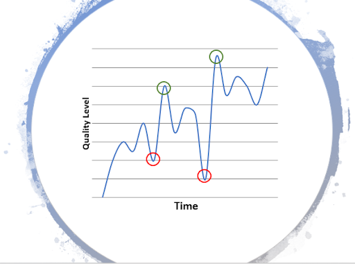
Figure 1 Ebb and Flow of Quality
Product Lifecycle and Quality Fluctuations
In Figure 1 I have shown how the quality level of an organization can vary over time for a particular product or service. Typically when products are initially created the quality level becomes a major issue once the product is deployed, particularly if there are multiple deployments that are being carried out. The first red circle represents when the quality gets really bad. Then there is a concerted effort on the part of the organization to improve quality and we hit the first green circle.
For anyone that has deployed a new product or service, at this point you know that then you breathe a huge sigh of relief. But sadly the story is not over. Almost immediately the quality level starts dropping again as the crisis is over. Over time we hit the second crisis point.
This is followed by a massive focus by the organization on quality to achieve a truly great level of quality which results in the second green circle in figure 1. And this cycle just keeps repeating. However, the problem is that as the surface area of the product increases, that is, as many more features are created, over time the swings become larger in magnitude. Eventually if there is a business need for the product or service you reach the point that the only solution is to sunset the current version of the product or service and create a brand-new version.
But would it not be great if we could mitigate those wild swings in quality? Would it not be wonderful if we had forward looking signals that we could measure that indicated that we were headed towards an Epic Fail? Well as it turns out there are some pretty straight forward metrics that come out of regular regression testing that give strong indications of what quality direction you are currently headed in. In the next section I am going to go through three metrics that can be useful if measured correctly.
Measurement
There are multiple methods to measure the quality of a product. These are:
- Defects found in the field
- Defects found in Full Regression
- Defects Open/Closed report
Defects Found in The Field
These are defects found by users of the system and that are being reported back to the company. This metric has many issues with it:

- Defects reported in the field are very expensive to triage and fix
- Often only the most severe defects are reported
- When you start seeing a lot of severe defects from multiple customers the proverbial sh$*t has already hit the fan.
When you are in trouble this metric just reinforces “the what” that the entire organization already understands – that there are major quality problems. It’s a painful lagging indicator. However, it works extremely well to get the necessary resources allocated. But by the time this metric triggers an alert you are deep in the valley and are likely to keep going down further! For the continued existence of the product or service the entire company mobilizes on a quality initiatives. However this can often lead to a crisis management culture that oscillates from major focus on quality to complete disinterest as soon as the customer crises are handled.
Defects Found in System Test
This metric can be an excellent predictor of upcoming quality problems. However, it requires a regular and consistent software regression test to be carried out on the product or service. An easy way to do this is to add the Webomates CQ service.
If there is consistent software regression being carried out AND the number of priority 1 defects being found is increasing, or the net defects found is increasing, this a powerful leading indicator that there is trouble dead ahead.
The two figures below show two different ways to view the new defects being found. Both views have value and given that most defect systems can make these graphs automatically for you I would look at both of them.
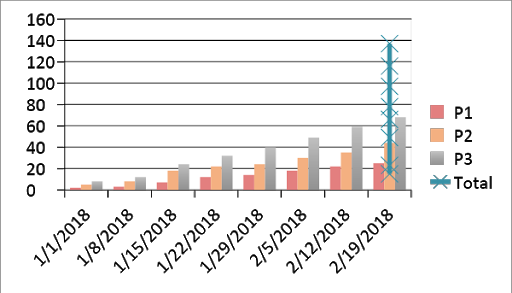
Figure 2 New Cumulative Defects by Priority
Figure 2 shows the cumulative number of new defects that are being found, detailed out by priority. The slope of the line indicates whether more or less defects are being found. It’s important to look at the priority of the defects being found as sometimes the total quantity of defects being found might decrease but if all the found defects are of high priority then clearly there is trouble ahead.
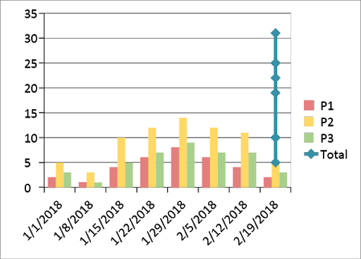
Figure 3 New Defects by week
Figure 3 shows new defects being found as a function of time. Looking at the figure there was a spike in the number of new defects being found shortly after 1/1/2018. Over time the number of new defects being found can be seen to be decreasing. This is repetitive with your comments for Fig 2. Either rephrase or delete completely.
Defects Open/Close Report
Another incredibly useful forward looking metric is defects found versus defects fixed.
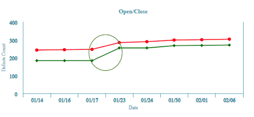
Figure 4 Webomates CQ: Good Open Close defect report
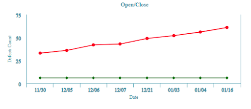
Figure 5 Webomates CQ: Bad Open Close defect report
The two figures above show two different versions of an Open Close report. In the first one (Figure 4) the number of defects being found is increasing but they are being fixed. At the circled point the number of defects that are open dramatically drops. In an ideal world the green and red lines would cross but in reality there are defects open when most software deploys. Thus the key metric to watch for is the gap between defects found and defects fixed (that is how many open defects there are) and is that gap increasing or decreasing.
Figure 5 shows a doomsday scenario as there are absolutely no defects being fixed. Thus, the technical debt is increasing over time. If the schedule and delivery is being measured on feature completion for example this scenario can happen to a development team. If no action is taken prior to deployment the likelihood of an Epic Fail is high, particularly if there are a high number of priority 1 defects.
Caveat Emptor
The basis of the defect metrics defined above presumes that regular software regression and feature testing is carried out. In another blog I had compared regression testing for software with exercise for humans.
Software regression testing is really that critical to the overall health of your software! If you don’t carry out regular software regression testing then you simply have no idea which direction you are headed in vis a vis quality. However, if you are monitoring the metrics that are defined above, without a full software regression being carried out, the metrics are at best incomplete and at worst will give you an incorrect picture of your software quality.
Conclusion
Metrics like open close defect reports are an excellent forward predictor of the software quality of your product or service. Defect discovery as a function of time is a good predictor of software quality. Bugs found in the field is not a predictor – it’s a lagging indicator. However, for these metrics to work correctly a regular complete software regression test needs to be carried out.
You can control the frequency of the software regression testing and the scope of the regression. In another blog I had discussed the concept of Overlapped Regression. The concept is that you should carry out a complete regression periodically, where “complete” is defined as every single test case on every single platform. This can be a daunting task as you may have thousands of test cases on multiple browsers and mobile platforms. Webomates CQ does this in 24 hours for you. However, a complete or what we call a Full regression is not necessary every single time. In overlapped regression we have a heartbeat of say once every week for the Full Regression and an Overnight execution that has a subset of the test cases executed concentrating on the area that development is currently working on.
If regular or overlapped software regression testing is carried out the Open/Close is a powerful tool that can be used to determine:
- Release readiness
- Quality level
- Area of focus for development (bug fix versus feature creation)
This can lead to a significant mitigation of the wild swings in quality that we saw in Figure 1. Try it out. Do some Full regressions and look at the defect open/close ratios. It’s really amazing how much of an impact these simple steps can make in improving the quality of your product. It certainly worked for me with multiple products in different industries.
If you are interested in learning more about Webomates’ CQ service please click here and schedule a demo or reach out to us at info@webomates.com

Aseem, Founder & CEO of Webomates, created Webomates CQ, an AI-driven testing platform that cuts testing time by 10x with AiGenerate , and accelerates test maintenance by 10x using AiHealing, with guaranteed 24-hour execution. A multi-technical Emmy award winner with AI automation patents, he writes about AI-first testing and faster, simpler software delivery.
Tags: Ebb, Software Testing
Leave a Reply